FIELD NOTE / OCTOBER 4, 2026
Custom coloring pages.
Light or Bold?
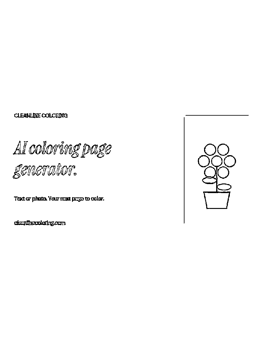
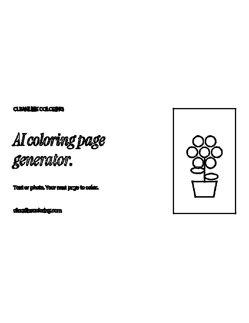
For our illustrated test card, Light left thinner flower outlines and more open lettering. Bold made the same marks heavier and preserved more of the rectangular border. Start with Light if you want this lighter result; compare Bold if you prefer stronger marks. Neither setting guarantees a good result from every photograph.
Compare your own image ↗The link opens Photo to outline. Choose the style in the tool before generating.
The same input, two actual downloads
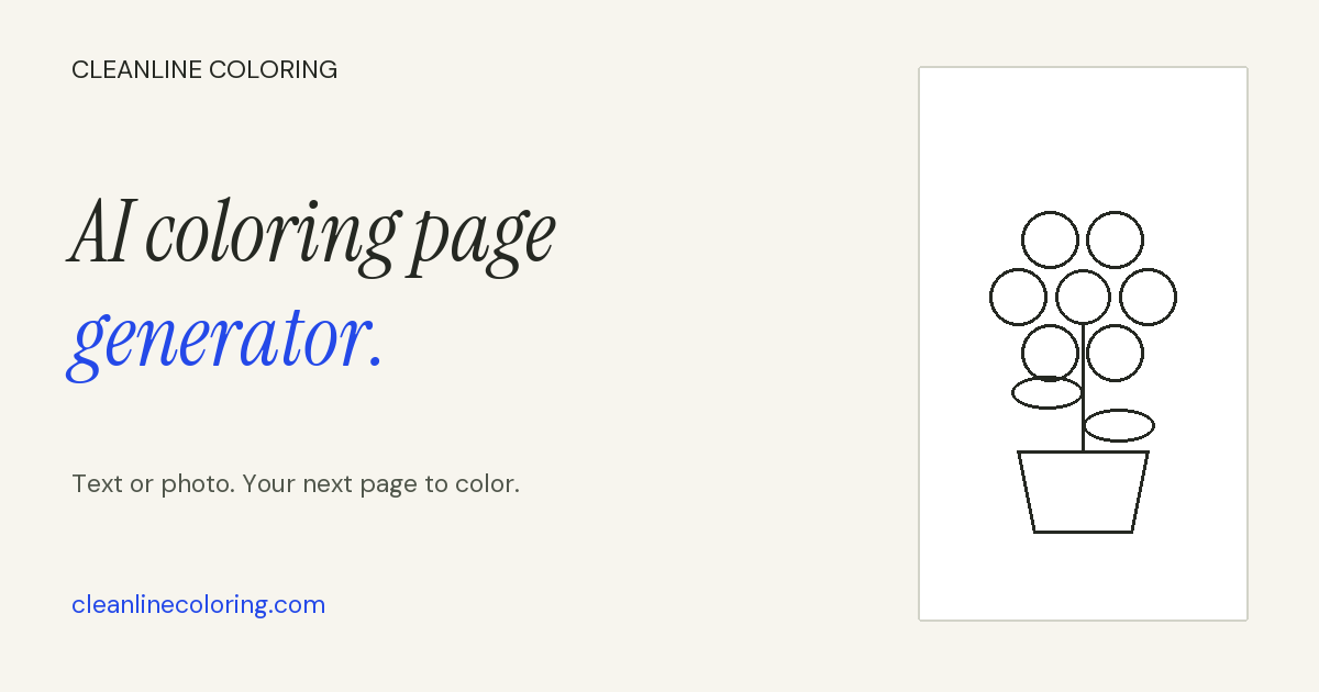
We selected our own illustrated share card in the live CleanLine tool, generated Light, downloaded its PNG, then switched to Bold and generated again without changing the input. Both runs used Portrait · 8.5 × 11 with Remove background unchecked. These are the actual downloaded images, not redrawn examples.
What we noticed when comparing the files
- Flower spaces stayed recognizable. Both outputs show the round petals, center, stem, leaves and pot. Bold thickens the boundaries; it does not create a different flower.
- The border changed. Light retained the left edge and much of the top, but not the right or bottom. Bold retained a more complete rectangle. A thinner result can lose a faint boundary you wanted to keep.
- Small lettering became cramped. The smaller lines on the card look rough in Light and heavier in Bold. Neither download is a substitute for setting readable text yourself. For an inspectable typed name, use the separate name-sheet tool.
- Page shape introduced white space. Our input is landscape, while both downloads are portrait. The picture occupies a horizontal band with blank space above and below. A line-style change does not solve that shape mismatch.
A choice to make before printing
Look at the smallest space you plan to color, not just the whole preview. In this example, the pot and petals remain available in both files, while heavier small lettering becomes less useful as a coloring area. Choose for the part of your own image that matters, then inspect the downloaded file at a comfortable size.
If your image needs a different page shape, choose it before generating again. Keep the original file so you can compare settings without changing the crop at the same time. We did not test another paper shape or a physical printer in this comparison; these files are evidence of a digital result only.
What this comparison does not establish
This is one controlled illustration test, not a score for photographs, faces, fur or busy backgrounds. We left background removal off, so it says nothing about that option. We verified PNG downloads in this run; we did not test PDF download, print sharpness or ink use. Do not treat thicker digital marks as proof of a better printed page.
The tool processed the selected image in the browser. Photo mode traces an existing input; text mode creates a new scene. For the broader workflow and current limitations, read photo to coloring page. If you want prepared sheets with deliberately different small features instead of two traces of your image, use our three original garden detail levels.
Questions about the two styles
Is Bold always more detailed?
In this card, Bold produced heavier lettering and a more complete border. That observation does not prove it recovers useful detail in every input. Compare the subject and the small spaces, not the label alone.
Do I need to reselect my file when switching styles?
We kept the same selected image, switched from Light to Bold, and clicked Generate again. The new download then reflected Bold. Merely selecting another style is not the same as saving a new result.
Can I download these exact examples?
Yes. The two links above save our actual PNG outputs. They come from our original illustrated input and do not include a visitor's private photograph. You can inspect them before trying your own permitted image.
Does this replace the general guide?
No. This note answers one narrower question: how the two line styles differed on the same input. The practical guide covers starting a page and choosing a format.